Receiver Operating Characteristic (ROC) Curves
Background
From time to time, an idea emerges that basically has merit, but is also a bit confused, and persists in large part because it has simply been around long enough that everyone has decided to except it for what it is (which is also a pretty accurate description of many professors, and perhaps quite a few spouses). I think the receiver operating characteristic (ROC) curve falls into this category of ideas. It is useful, and it does make sense, but if someone proposed the idea to me now, I would be skeptical of its utility.
For background, the ROC curve was first proposed during World War II. Radar technology—pioneered in the U.K., and imported by the U.S.— was used throughout the war to monitor and detect incoming enemy aircraft. Radar “receiver operators” were assigned the task of analyzing radar signals to distinguish enemy aircraft from friendly aircraft (and noise). The ROC curve was developed as a part of “signal detection theory” as a means of assessing the “characteristics” of receiver operator ability.
Decades later, the ROC concept was revived by medical researchers as a means of assessing diagnostic tests, and is now a basic tool of data science and machine learning research, where it is used a means of quantifying the quality of classification methods.
Description
The ROC curve of a classifier is defined as the graph of the classifier’s “true positive rate” as a function of its “false positive rate.” The horizontal axis—false positive rate—is the number of negative examples that are labeled positive divided by the total number of negative examples. A more descriptive name would be “one minus the accuracy on negative examples.” The vertical axis—true positive rate—is the number of positive examples that are labeled positive divided by the total number of positive examples, which is just the “accuracy on positive examples”.
Typically, a classifier, or “expert”, assigns a “score” to examples, which are then labeled as positive or negative based on whether the score exceeds a fixed threshold. For example, the score generated by a logistic regression is the probability that the example is positive. We can label examples as positive if the score exceeds 50%, or we could require a higher threshold, say 75%. Varying the threshold leads to a tradeoff between accuracy on positive examples and accuracy on negative examples. As the threshold is increased, accuracy increases on negative examples and decreases on positive examples. At the extreme, when the threshold is set to 100%, we have 0% accuracy on positive examples and 100% accuracy on negative examples. The ROC curve is generated by “tracing out” this tradeoff as we varying the threshold from a lower bound to an upper bound as shown in the chart below.
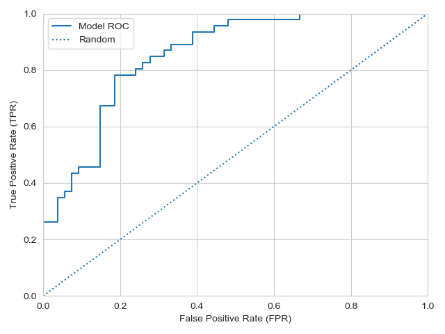
The dotted line in this chart represents a “random guess” model in which examples are labeled at random according to a fixed probability \(p \in [0, 1]\). If \(p = 0\), then all examples are labeled negative. In this case, accuracy on true examples is zero, but accuracy on negative examples is one, which puts us in the lower lefthand corner. Conversely, if \(p = 1\), we find ourselves at the upper righthand corner where accuracy on positive examples is 100% and accuracy on negative examples is 0%. The solid curve is the actual ROC curve. The ROC curve always agrees with the random guess model at the extremes where it collapses to a deterministic guess.
Moving from right-to-left or bottom-to-top in the FPR-TPR space leads to a classifier that is more accurate on negative examples or positive examples, respectively, while moving in both directions leads to a classifier with higher overall accuracy. Looking at the example ROC curve, we see that it lies northwest of the diagonal line, suggesting that this model is “better” than the random guess model. Notice, though, that the two dimensions represented by the ROC curve (FPR and TPR) are independent of the prevalence of positive and negative examples in the data. A not-totally-obvious implication (to me, at least) is that improving a classifier’s performance in the ROC framework will not generally lead to a classifier that performs better at the task you care about (e.g., increasing overall accuracy).
Everything that I have said thus far is the standard representation of the ROC curve. I have always found the idea of putting the false positive rate on the horizontal axis to be rather odd. If the task at hand is such that false positives are particularly costly, then I can understand the motivation for using FPR. It seems to me, however, that being concerned about false positives is just being concerned about accuracy on negative examples: they are equivalent, in fact. In that case, it seems more natural, and easier to understand, to plot the “true negative rate” along the horizontal axis, as the true negative rate is the accuracy on negative examples. Represented this way, moving out along either axis improves classification (instead of moving in opposite directions, as in the standard setup):
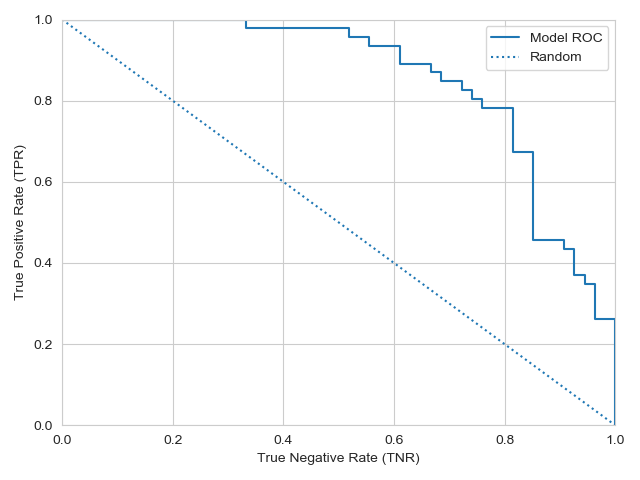
That’s better! Now an ideal classifier is at \((1,1)\)—perfect classification of positive and negative examples. This representation also clarifies the goal of the ROC framework, which is to separate two dimensions of performance: accuracy on positive examples, and accuracy on negative examples. And we can still calculate all ROC-related metrics (see following section).
Interpretation
In the ROC framework, we focus on comparison of a classifier or expert against the random guess classifier described above (the diagonal, dotted line). The random guess classifier is accurate on positive examples with probability \(p\), and can only improve her accuracy on positive examples by giving up exactly the same amount of accuracy on negative examples, and vice-a-versa. An ROC curve that plots above the random guess model is in some sense informed, but it would be nice to quantify how much better a particular model is. Let’s look at a few popular methods that accomplish this.
First, there is the “Area Under Curve” or “AUC”, which is the just area underneath the ROC curve. While this quantity seems intuitively appealing, it in fact has a precise meaning: it is the probability of ranking examples in the correctly. Specifically, suppose we choose one positive example and one negative example at random and use the classification model assign each example a score. The AUC is the probability that the positive example receives a higher score (assuming higher scores align with positive examples). Thus, we can say that a classifier with a higher AUC is more likely to rank examples correctly.
(A related value is the “Gini coefficient,” which is twice the AUC minus one:
\[Gini = 2 \times AUC - 1 = 2 \times (AUC - AUC_{\text{Random}})\]To understand the rationale of this quantity, note that the random guess model has an AUC equal to 0.5, so the Gini coefficient is equal to twice the improvement in ranking ability of the model over the random guess model).
Second, we have “Youden’s J Statistic”, which is defined as the distance between the diagonal and the ROC curve at any given false positive rate. This statistic also has a meaningful interpretation: it is the probability of making an “informed decision”. Specifically, imagine we select a desired false positive rate, \(p\). At the point on the ROC curve where the false positive rate equals \(p\), the random guess model has the same false positive rate, and in that regard the two models are equal. Given a random positive example, and assuming the ROC curve lies above the diagonal, the probability that the model correctly classifies the example is the true positive rate at the point, \(TPR(p)\), while the random guess correctly classifies the example with probability \(p < TPR(p)\). We can consider that the model makes an “informed” decision when it correctly predicts an example that the random model guesses incorrectly, which happens with probability \(TPR(p) - p\)—i.e., Youden’s J.
Generic credit scoring models commonly use the so-called “KS Statistic” to measure quality. It turns out that the KS statistic is equal to the maximum Youden’s J statistic along the ROC curve, and thus represents the maximum probability of making informed decisions across all possible thresholds—the maximum “informativeness” the model can attain. In this sense, a model with a higher KS statistic can be thought as being more informative.
Finally, as a brief aside on interpretation of the ROC curve, while not generally seen in practice, it is possible to for a model to have an ROC curve that lies below the diagonal. Following the advice of such an expert is worse than randomly guessing. However, following the opposite of their advice is better! I am often reminded of this fact when I hear Donald Trump speak: as generally rule, it seems profitable to assume the opposite of what he says as the truth.
Limitations
Here’s the thin about the ROC framework: the random guess model doesn’t know anything about the world. In practice, we typically know something. At a minimum, we usually have a decent idea what the proportions of positive and negative examples are. Thus, if we want to know whether our classification model really learned anything meaningful, we ought compare against a “constant model” (think of logistic regression model that only includes an intercept). The constant model guesses all one way or the other, depending on the threshold. In terms of the ROC curve, it doesn’t have one: it is always in one of the corners on the diagonal. As a result, the ROC framework doesn’t really allow us to compare our model with a constant model. In order to do that, we need to pick a metric that we care about and see whether our model performs better than the constant model with respect to that metric. But this begs the question: “Why use the ROC curve in the first place?”
If you truly know what your objective is, then I think the answer is, “Don’t use it!” But sometimes we just want to find a “good” classifier, and the ROC curve provides a framework for that task.